ZINE: Emotions Through Color!
- Taylor Vieweg
- Sep 26, 2024
- 2 min read

Updated: Oct 1, 2024
In this zine, I explore how colors embody the emotional spectrum, using different hues to convey a distinct mood or feeling. The core idea of my work—"Colors as Emotions"—guides a visual narrative, where each page dives into a specific emotional experience through color. From the fiery intensity of red to the serene calm of light blue, I aim to evoke perceptive reactions in viewers, allowing them to connect with these universal emotions on a personal level. The project was inspired by the way that colors influence human emotions and communication. I wanted to show this idea by giving each color a visual language, creating abstract yet associative imagery that invites reflection from viewers. My process combined digital collage techniques and digitally drawn elements, using layers to emphasize the depth and complexity of each emotion.
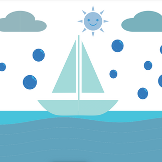
Each color in this zine was carefully selected to evoke a specific emotional experience. Red represents anger, capturing the raw intensity of fiery landscapes and aggressive movement. Orange symbolizes energy or excitement, filled with vibrant scenes and the glow of a fresh sunrise. Yellow conveys happiness, radiating warmth through sunflowers, smiles, and sunlight, evoking a sense of joy and positivity. Green explores growth, showing the duality of expansion in nature. Deep blue brings a sense of sadness and calm, using imagery of rainy days and oceans to evoke feelings of isolation and quiet reflection. Light Blue embodies peace and tranquility, featuring serene, still environments including soft clouds and gentle lakes. Purple represents mystery, blending abstract imagery invoking wonder and imagination. Pink signifies love, using soft, dreamlike images of roses to express affection. White embodies purity and peace, with clean, minimal visuals such as doves and symmetry, suggesting clarity and serenity. Black channels fear, with little details and dark shadows evoking intimidation and the unknown. Gray represents boredom and neutrality, using and dull, muted imagery to convey a monotone. Finally, Brown is grounded in nostalgia, filled with natural textures and vintage elements such as a picture frame, which evoke comfort and reflection.
One of the biggest challenges was striking a balance between abstract forms and recognizable imagery. This balance allowed the emotions to be both relatable yet open to interpretation. This project reinforced my belief in the power of color as a non-verbal communicator, and I am eager to continue exploring this dynamic relationship in my future work.


Comments